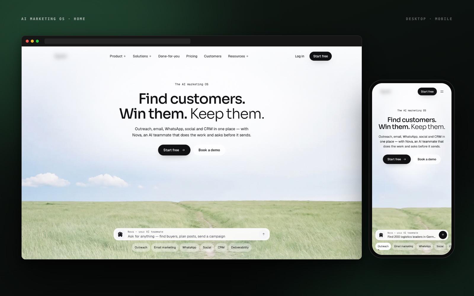
SaaS Platform · UI/UX Design
Case Study
AI Marketing OS
One product that brings cold outreach, email marketing, WhatsApp, social, and CRM together — with Nova, an AI teammate that plans the work and asks before it sends. We designed the interface and built the site that sells it.
The Challenge
Seven products. One login. Zero clutter.
The platform replaces five disconnected tools — lead lists, cold email, a shared inbox, WhatsApp on someone's phone, and a spreadsheet of deals — with one platform. That breadth is the pitch, and it's also the design problem. Outreach, email marketing, WhatsApp, social, CRM, deliverability, and an AI teammate (Nova) that plans and executes work across all of them: each has its own mental model, and the AI layer adds trust and approval flows on top. The interface had to explain all of this in seconds, feel light rather than overwhelming, and make 'approve before it sends' the obvious default — on a desktop and on a phone.
Our Mission
"Make a seven-module platform feel like one calm product — so a founder can find buyers, write to them, and close the deal without ever feeling they've switched tools."
The Process
How we
approached it.
Map the product and the message
We mapped every module, user journey, and credit-priced AI action, then wrote the one-line promise for each page so design and copy moved together.
Build the design system
A quiet, editorial system: one type scale, generous whitespace, calm natural photography, and a single accent — so dense product information reads as easy.
Design the Nova approval flow
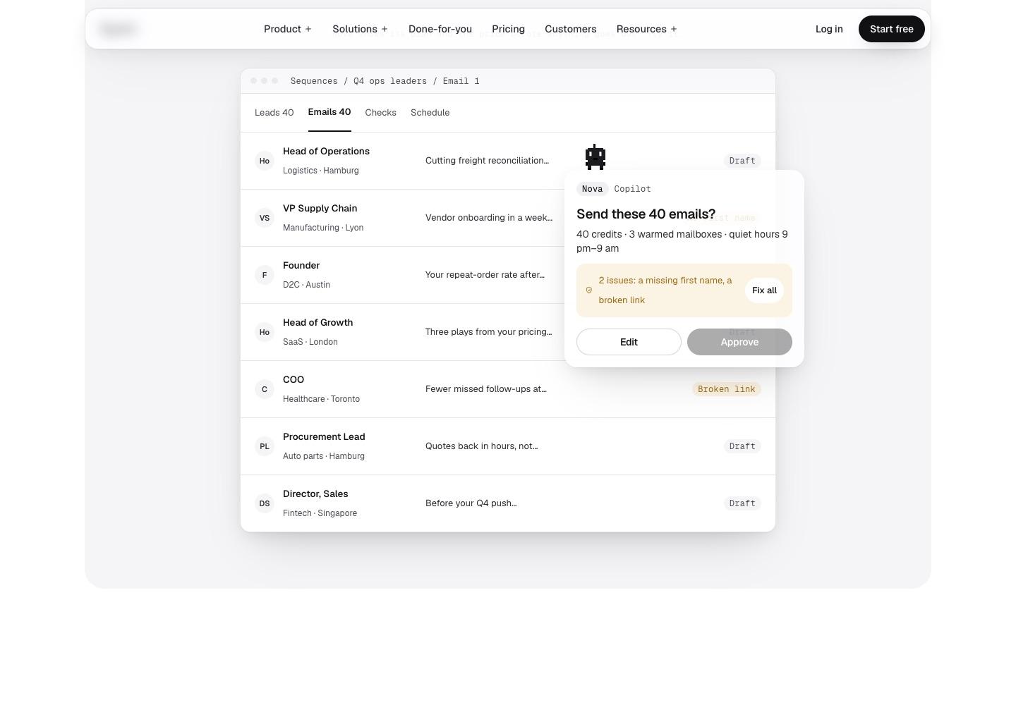
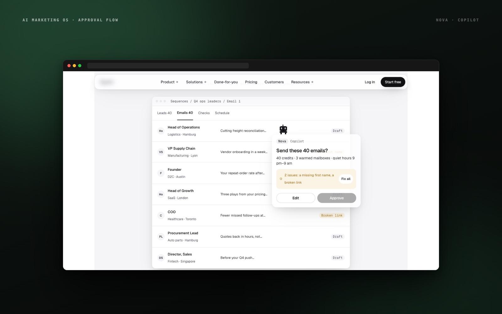
The chat-to-plan pattern: Nova shows its steps and the credit price, and nothing goes out until the user says yes. Copilot or Autopilot is a visible choice.
Build and ship responsive
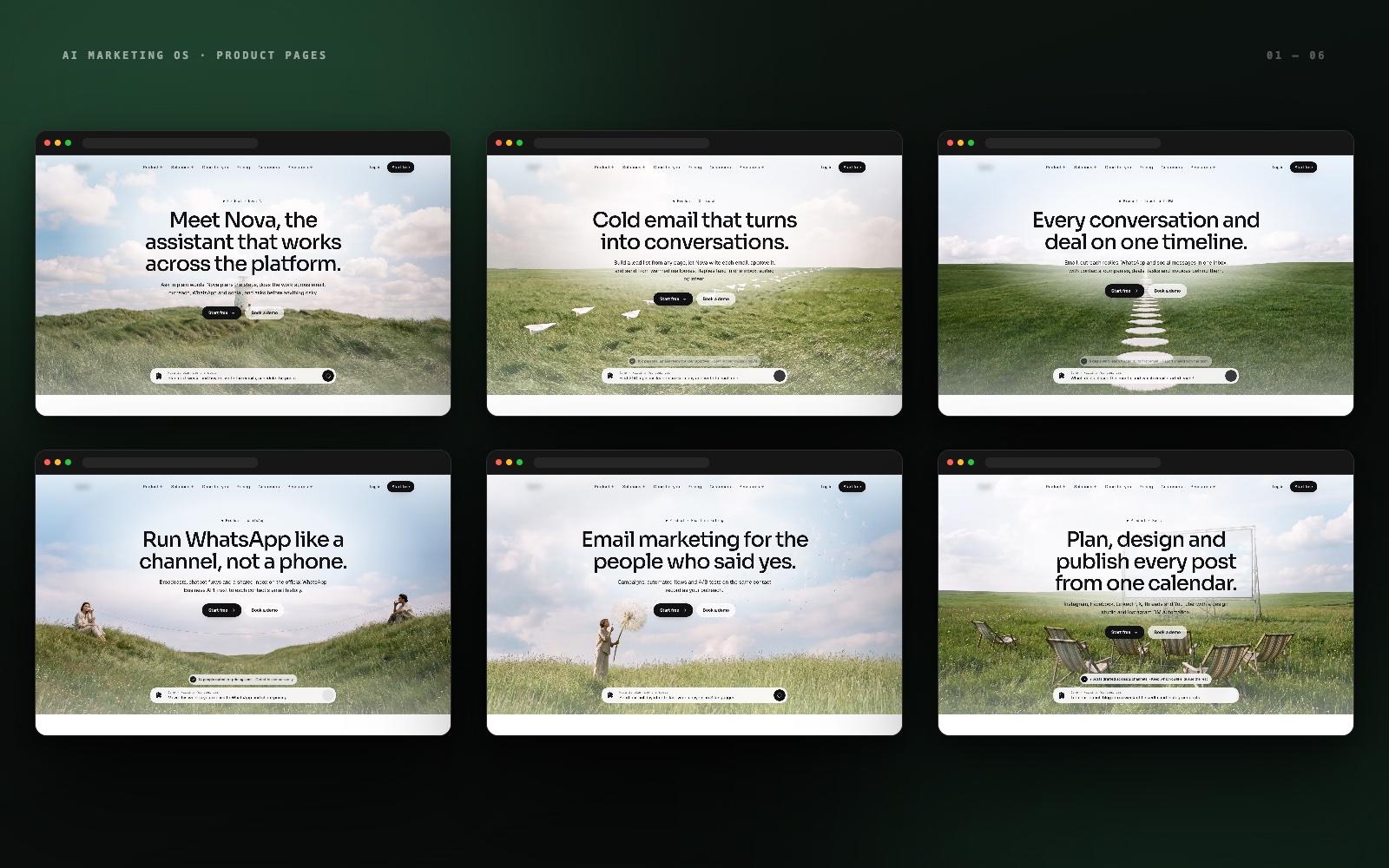
Product pages for every module, pricing, comparisons, solutions, and customer stories — more than thirty pages built in Next.js and shipped mobile-first.
Technology Stack
Core Solutions
Form meets function.
One Pattern for Every Module
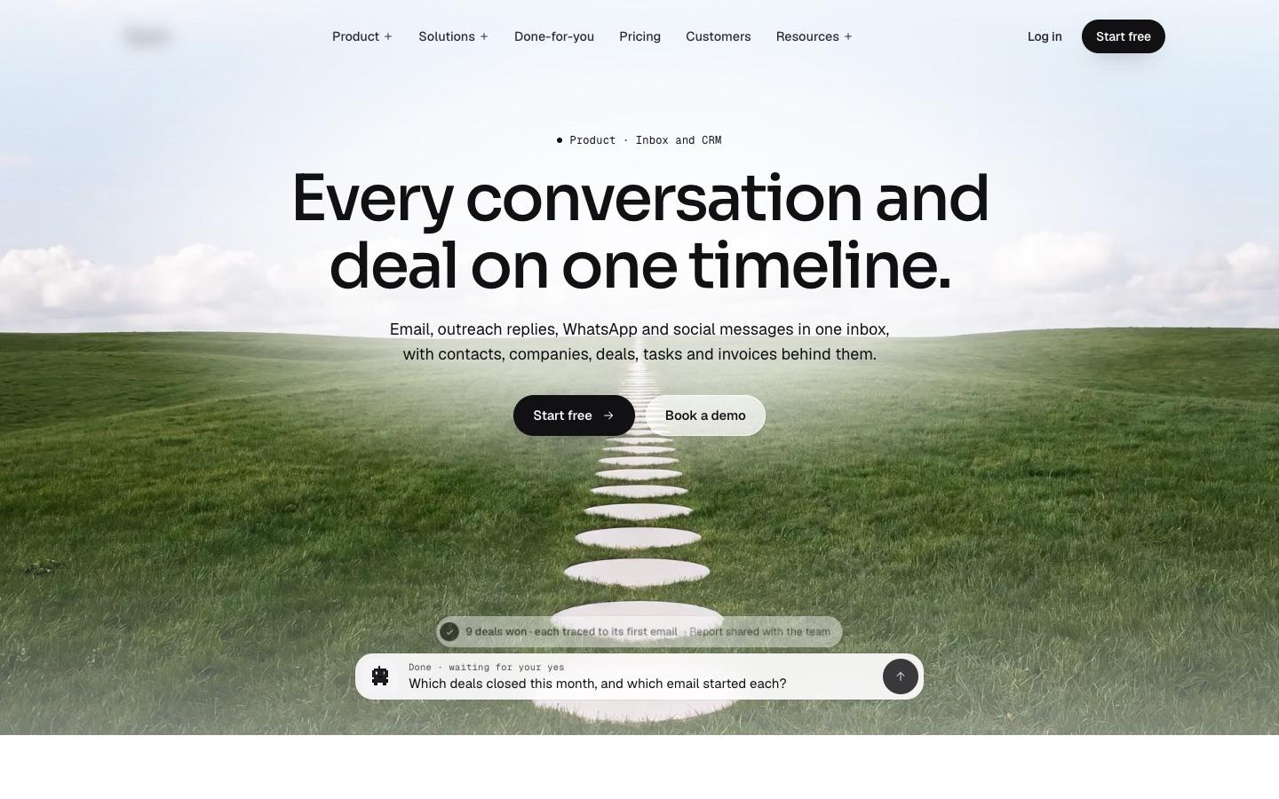
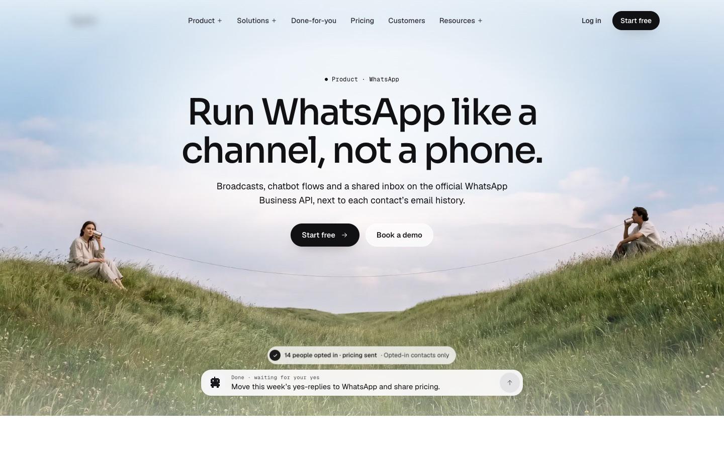
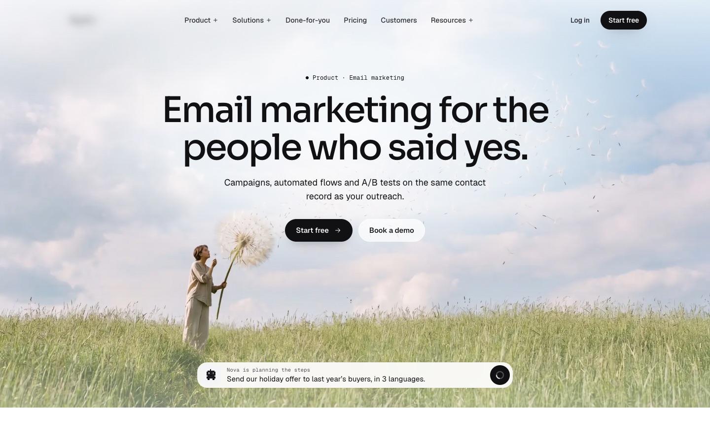
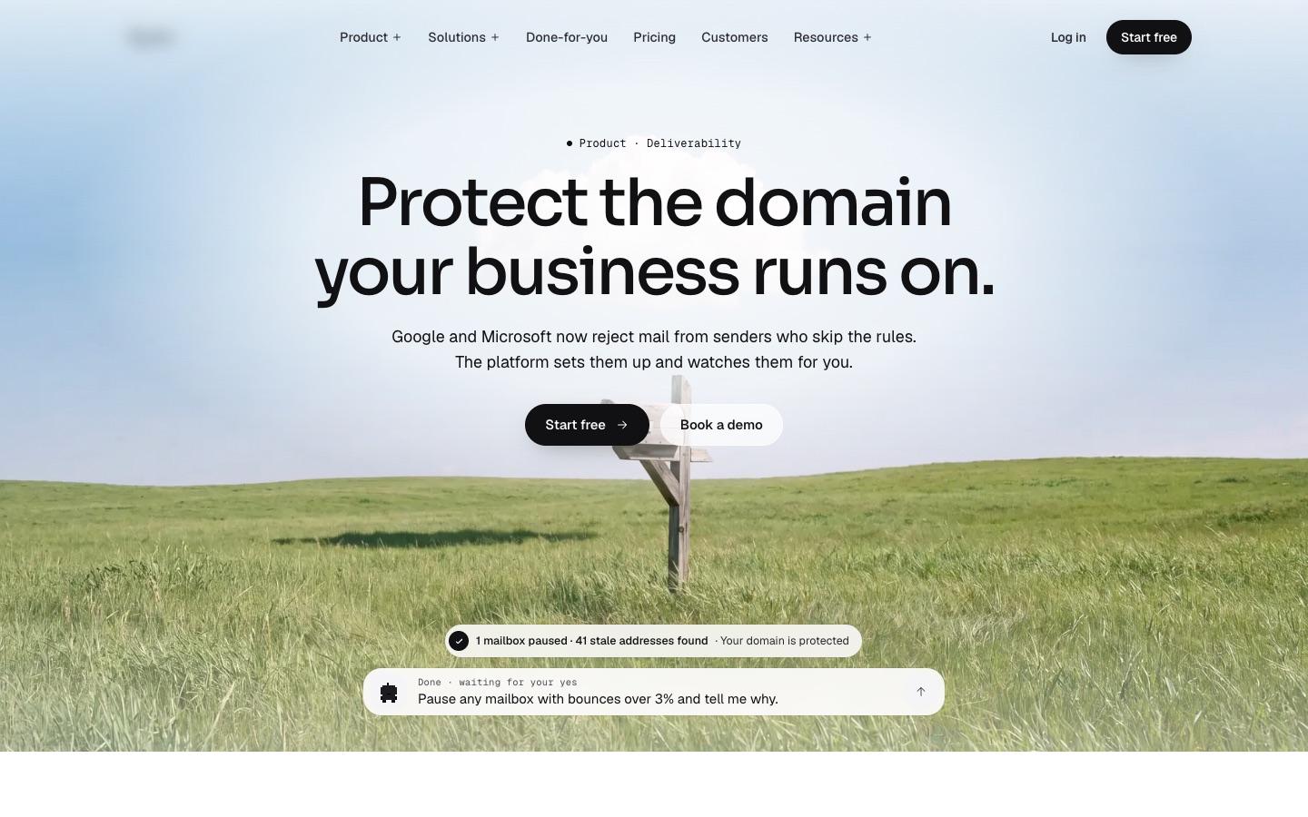
Each product page follows the same spine — a plain-language headline, a live Nova prompt showing what you can ask, then a numbered list of what the module does. Learn one page and you've learned them all.
Nova's Plan-Then-Approve Flow
The AI teammate is designed around trust: every request becomes a visible plan with step counts, credit costs, flagged issues, and an Approve button. Autopilot is something you switch on, never a surprise.
Real UI Inside the Marketing Site
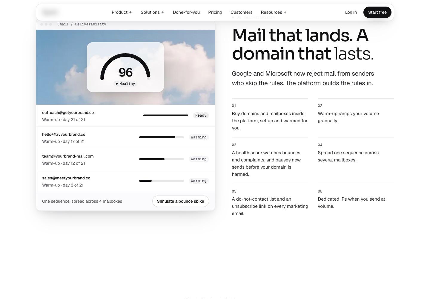
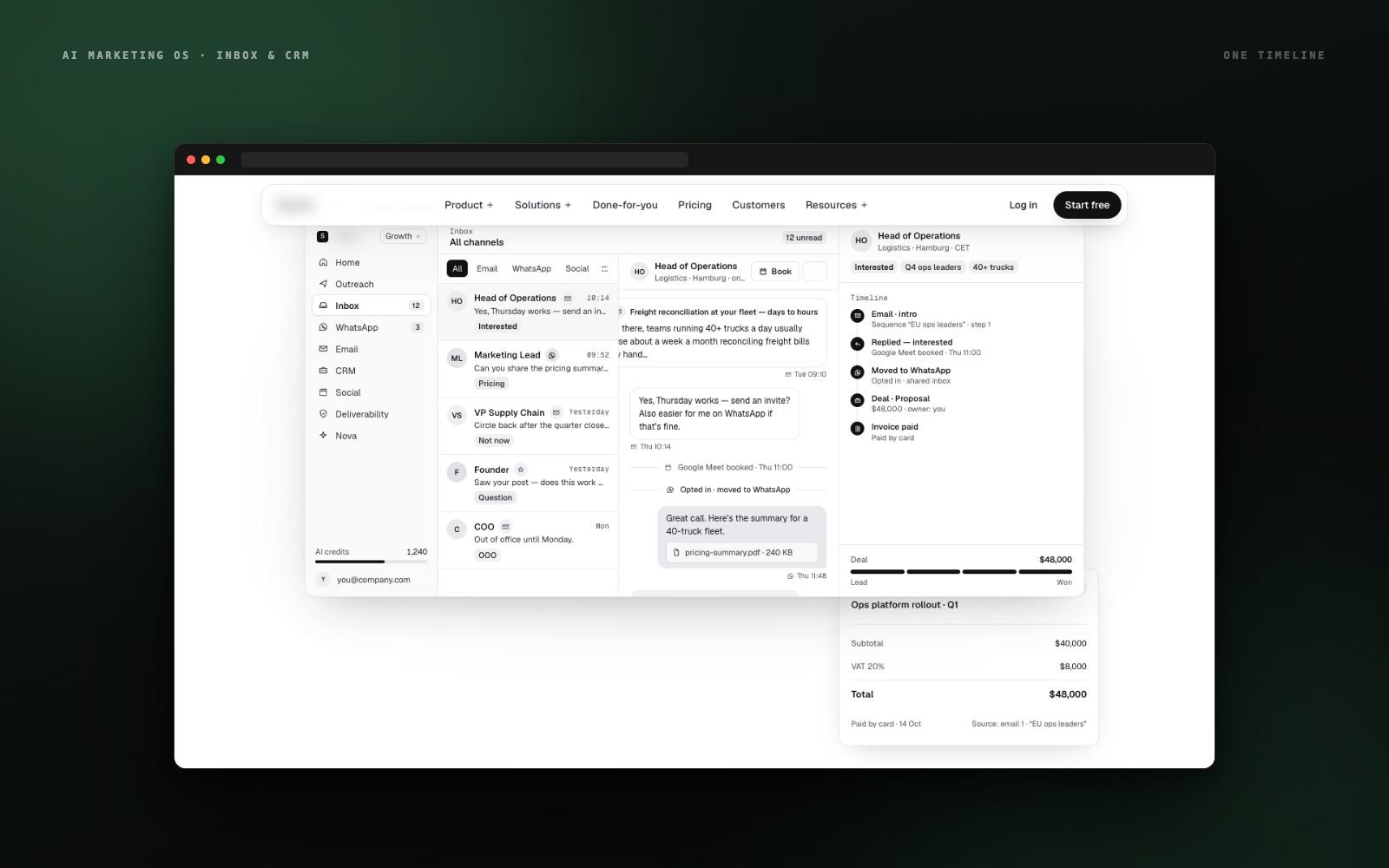
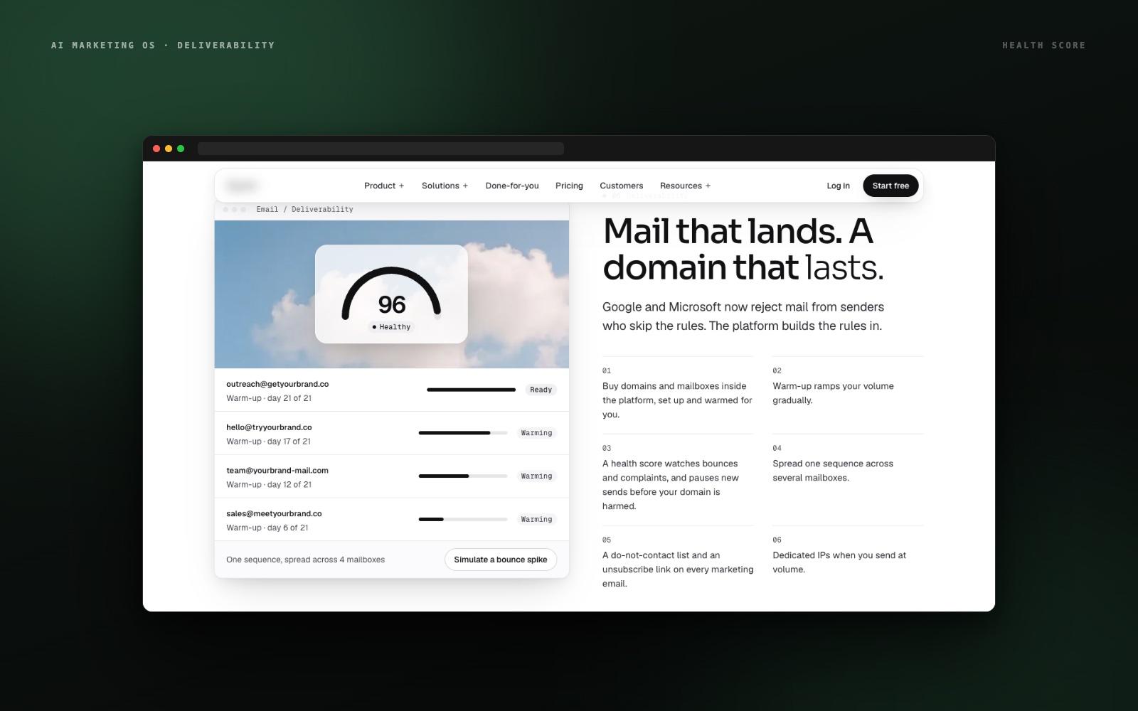
Actual interface components — the sequence editor, mailbox health scores, warm-up progress, the shared inbox — are embedded on the site so buyers see the product, not stock illustrations.
Pricing You Can Read in Ten Seconds
Four plans on one row, the same plan names on the site and in the app, and a credit price shown before any AI action runs. No decoder ring required.
The Interface
Every module, one language.
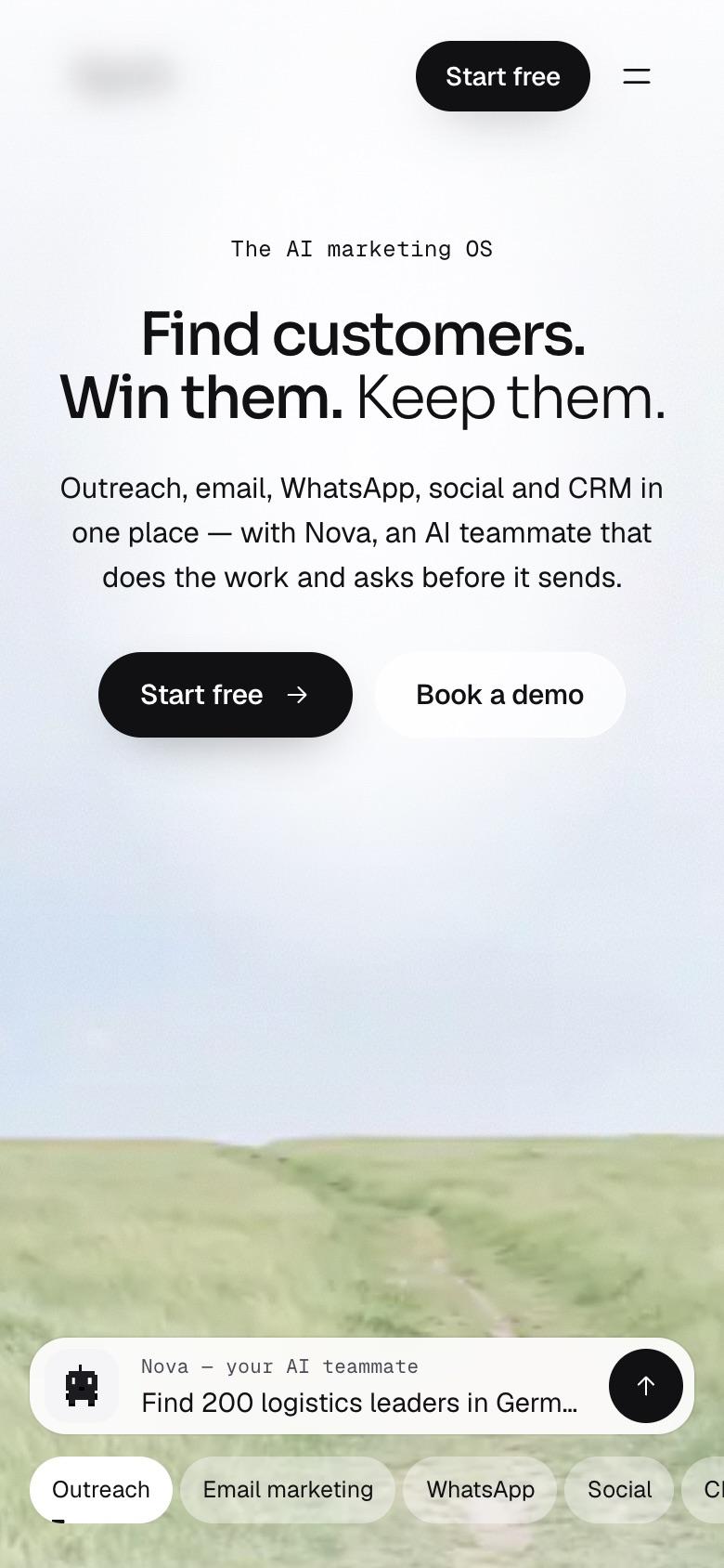
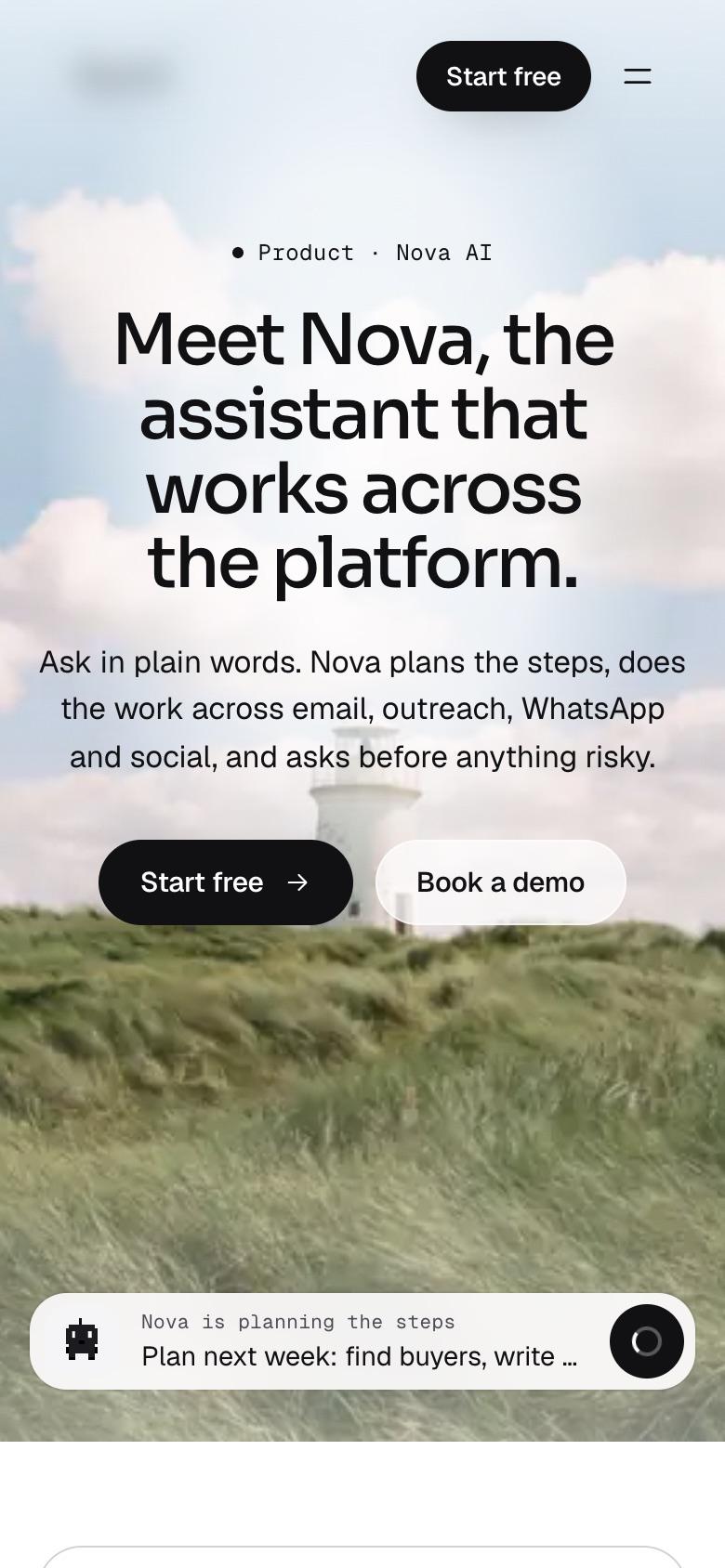
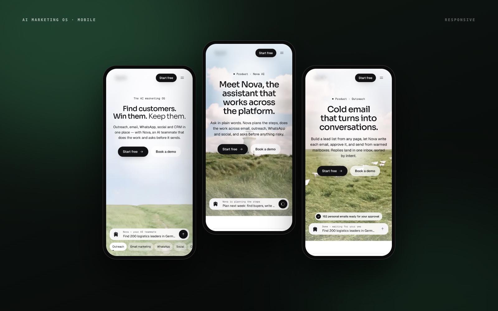
The same layout, type, and photography carry across the home page and every product page — so a visitor who understands one screen understands the whole platform.
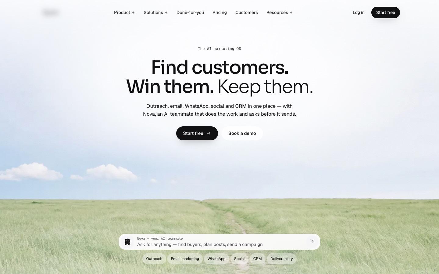
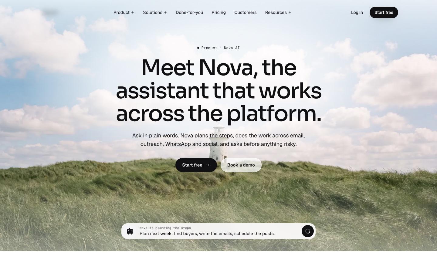
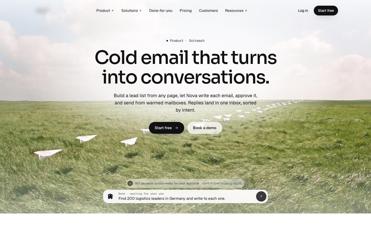
Responsive — on the phone
Selected Outputs
Built frame by frame.
The Impact
A platform that explains itself.
The platform's interface now carries the whole story — seven modules, an AI teammate, and a credit-based price — without a demo call. Every product page follows the same pattern, real UI replaces illustrations, and the approval flow makes handing work to AI feel safe. The same design language runs the marketing site and the product, so what buyers see on the site is what they get after sign-up.
7
Product Modules Designed
30+
Pages Designed & Built
4
Pricing Plans, One Row
9
Comparison & Solution Pages
The Research Behind It
Why calm design sells complex software.
These are independently published findings on how people judge and read websites — shown to explain the design choices, not as results we claim for this client.
46%
of the comments people made when judging a website's credibility were about its visual design — more than any other factor.
Source: Stanford Web Credibility Research (Fogg et al., 2003)
~20%
of the words on an average web page are actually read, so headlines and the first line have to carry the message.
Source: Nielsen Norman Group (2008)
10–20 sec
is how long most visitors stay unless the page communicates a clear value proposition quickly.
Source: Nielsen Norman Group (2011)
More Work