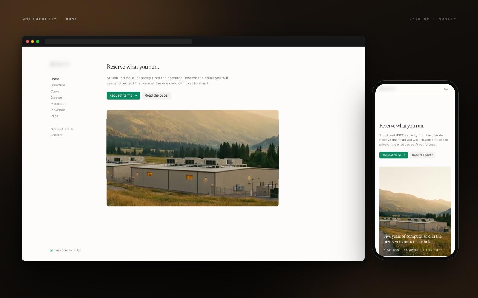
AI Infrastructure · Web Design
Case Study
GPU Capacity Website
A marketing site for a GPU operator selling five-year B300 compute as separately priced pieces — backbone, flex, price cap, and deferred option. Designed, built, revised, deployed, and handed over in seven days from the discovery call.
The Challenge
A complex product, a hard deadline, and no room for a second draft.
The client sells GPU capacity the way a trading desk sells structured products: a 2,048-GPU, 60-month program split into a backbone reservation, a flexible sleeve, a price cap, and a deferred option, each priced on its own. The site had to explain that to CFOs and infrastructure leads without a sales call, publish the implied price curve as real charts rather than slides, and carry a research paper — and the brief came with a one-week deadline. Discovery call on day one, live and handed over by day seven.
Our Mission
"Turn a dense financial structure into a site a buyer can understand on the first scroll — and ship it in a week, not a quarter."
The Process
How we
approached it.
Scope to the week
We agreed the page list, the charts, and the copy sources on the discovery call itself — so no time went to scope debates later.
Build in the open
A live preview link from day two meant feedback arrived against the real site, not a mock-up, and changes landed the same day.
Ship, then hand over
Production deploy, domain, analytics, and a walkthrough so the client's team could edit copy and chart figures themselves.
Delivery Timeline
Discovery call to handover in seven days.
One week, one team, one live link. Here is how the days went — from the first conversation to the final handover.
- Day 1
Discovery call
A working session with the client's team to understand the offer, the audience, and the paper. We left with the page structure (Home, Structure, Curve, Sleeves, Protection, Playbook, Paper), the figures that had to be charted, and the tone: editorial, calm, no hype.
- Sitemap
- Content outline
- Chart list
- Day 2
Design direction and skeleton
Typography, palette, and the fixed side-navigation layout decided in the morning. A working Next.js skeleton with real copy slots was deployed to a preview link by the evening.
- Design direction
- Preview link
- Day 3
First version
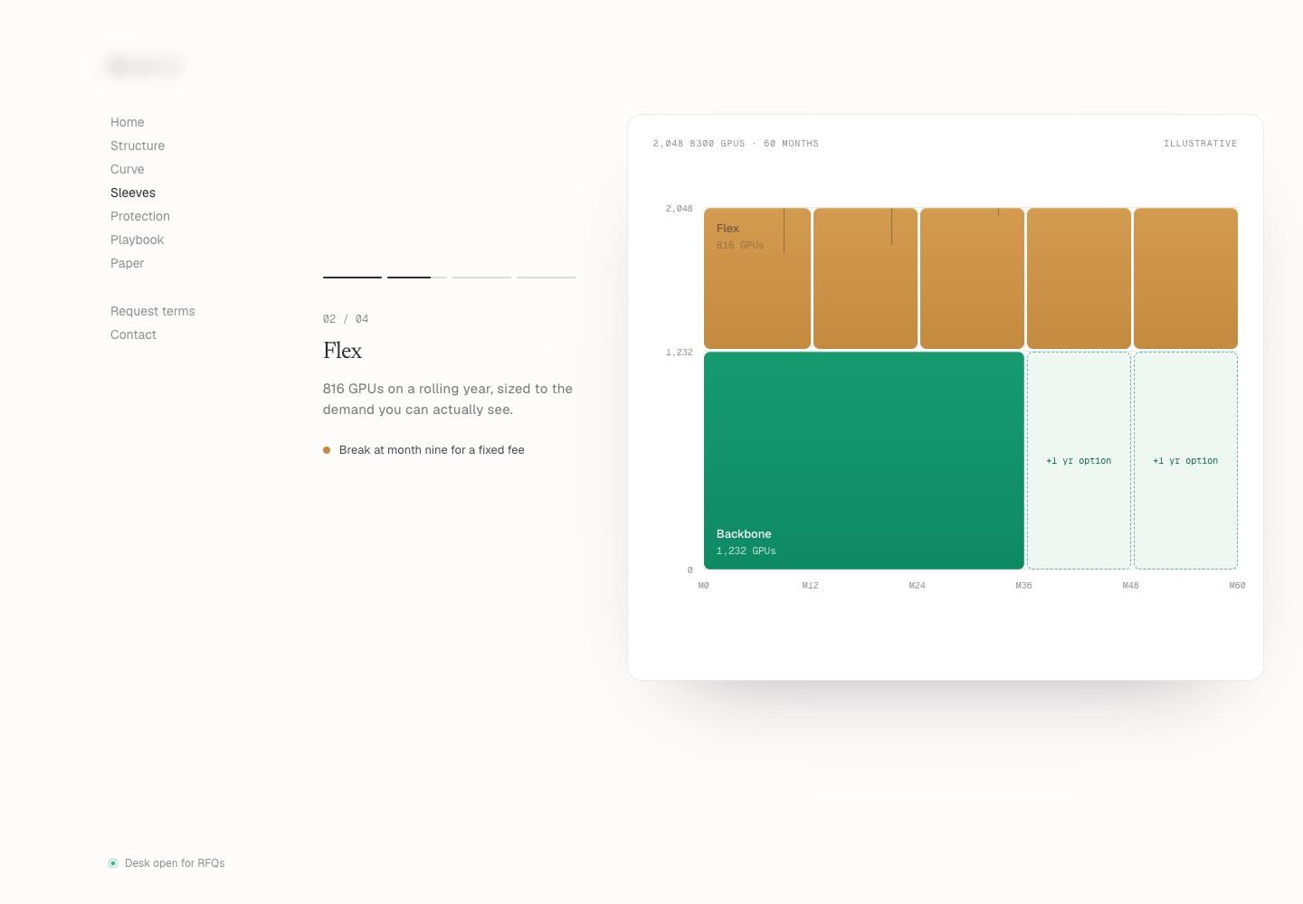
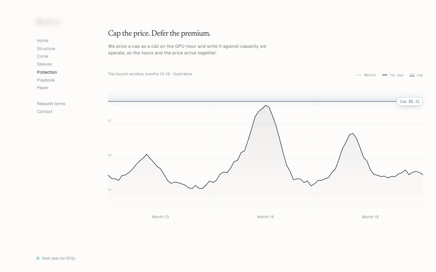
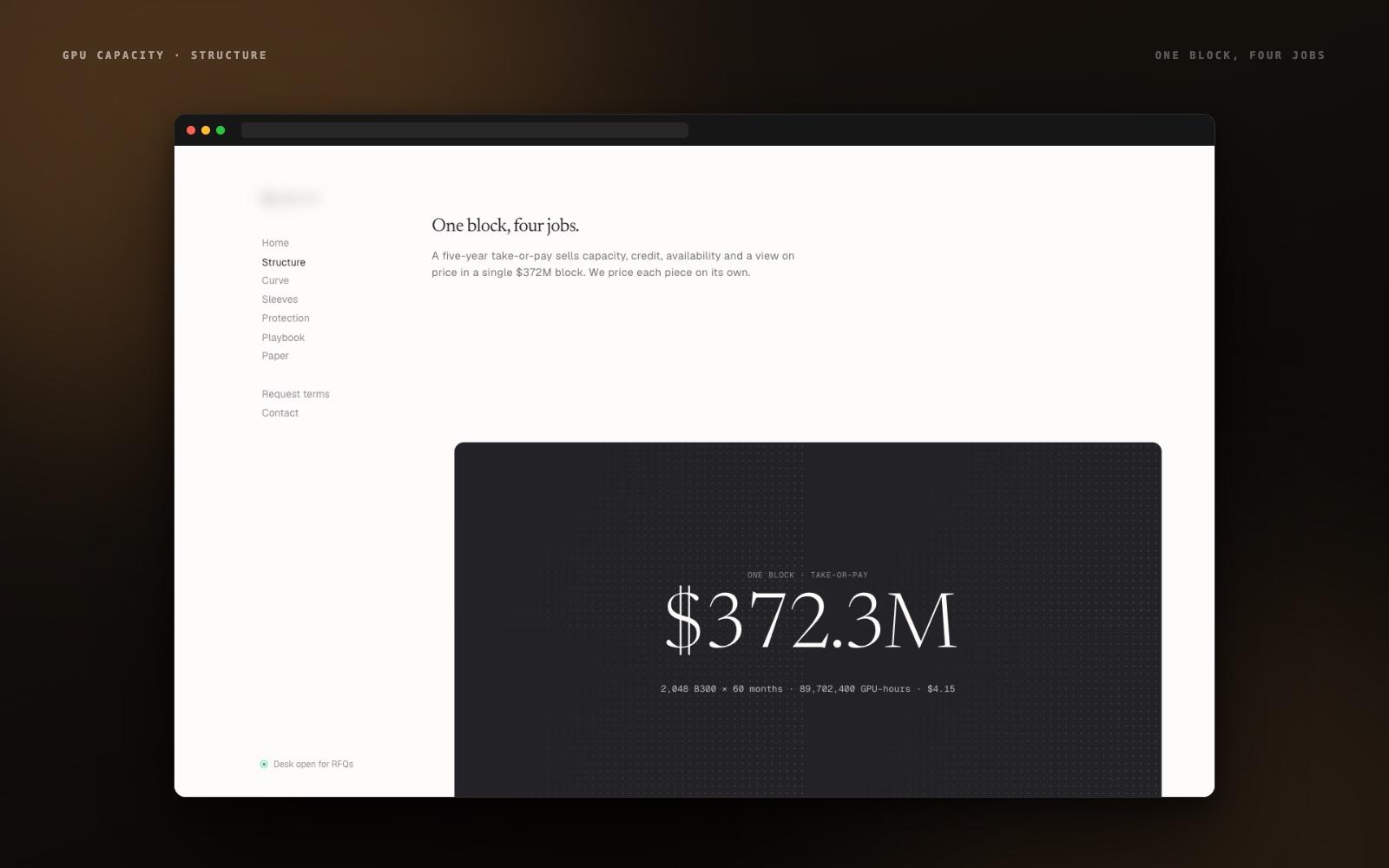
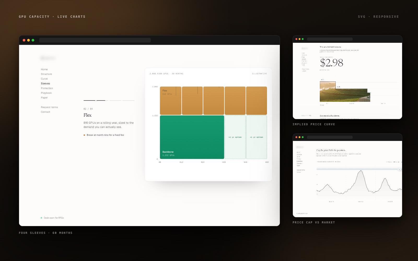
Every section built with real content: the one-block structure panel, the implied price curve, the four-sleeve program chart, and the cap-versus-market illustration. Shared with the client for review.
- First version
- 3 live charts
- Day 4
Client review and changes
First round of feedback worked through the same day: copy tightened across the Structure and Protection sections, chart labels and figures revised, section order adjusted, and the mobile layout refined.
- Revision round 1
- Day 5
Paper page and polish
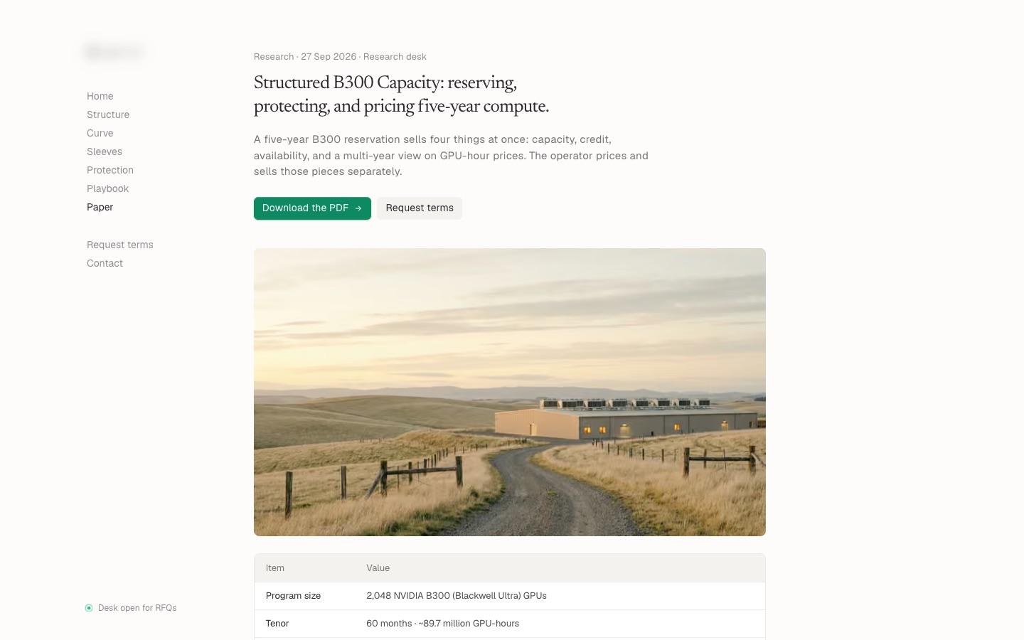
The research paper page built with download and request-terms actions, imagery balanced across sections, a performance and accessibility pass, and a second round of small fixes.
- Paper page
- Revision round 2
- Day 6
Final deployment
Production deploy, custom domain, analytics, and search and social metadata. Final sign-off on the live site rather than a staging copy.
- Production deploy
- Domain & analytics
- Day 7
Handover
A walkthrough of the codebase and content files, a short written guide for editing copy and chart figures, and repository access transferred to the client's team.
- Walkthrough
- Editing guide
- Repo transfer
Technology Stack
Core Solutions
Form meets function.
The Structure, in One Block
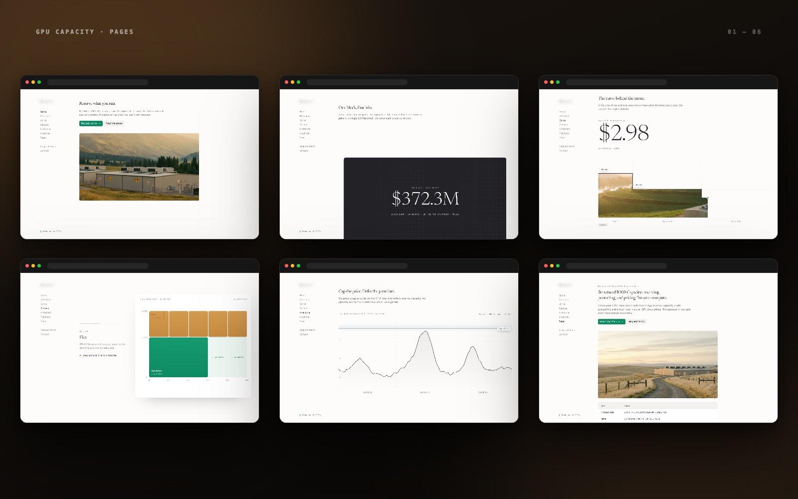
A single dark panel states the whole deal — 2,048 B300 GPUs, 60 months, one term sheet — then four numbered cards break it into backbone, flex, deferred option, and price cap. Complex, but readable top to bottom.
Charts That Carry the Argument
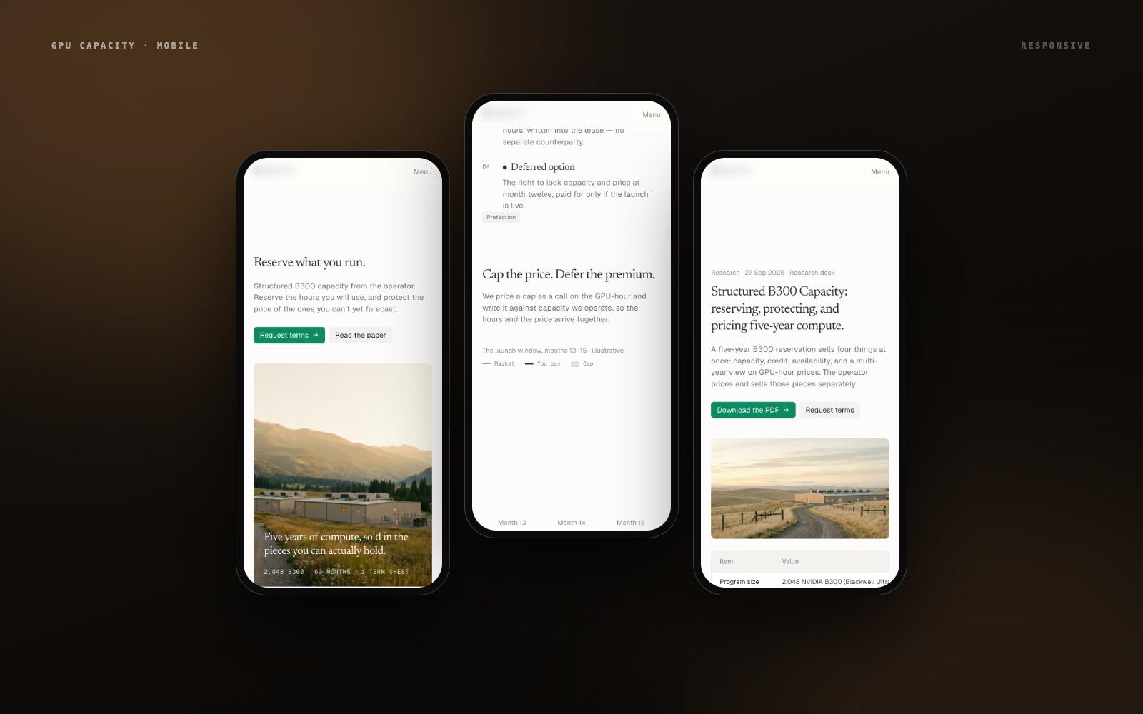
The implied price curve, the four-sleeve program over sixty months, and the cap-versus-market illustration are built as live, responsive SVG charts — not screenshots lifted from a deck.
Editorial, Not Hype
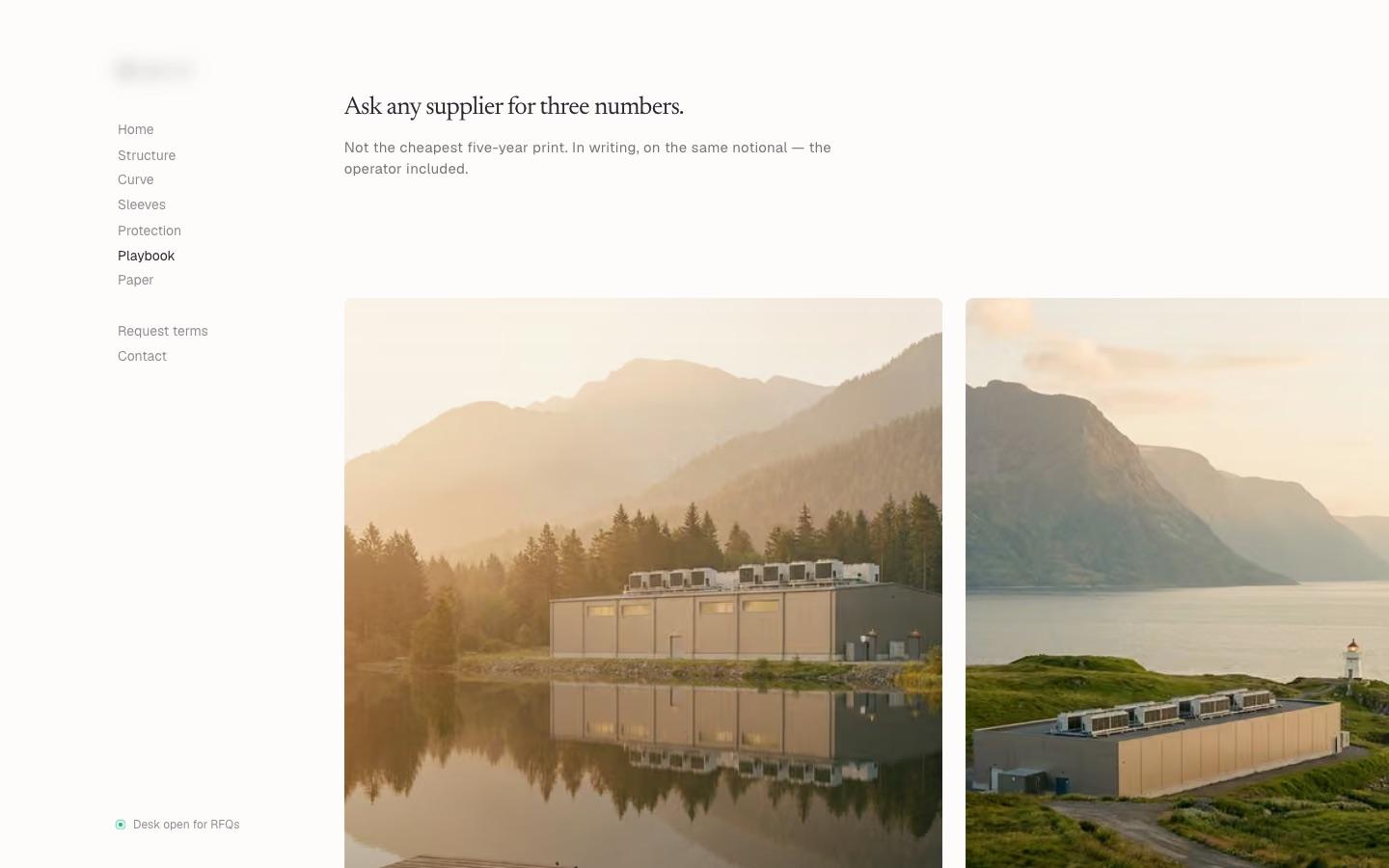
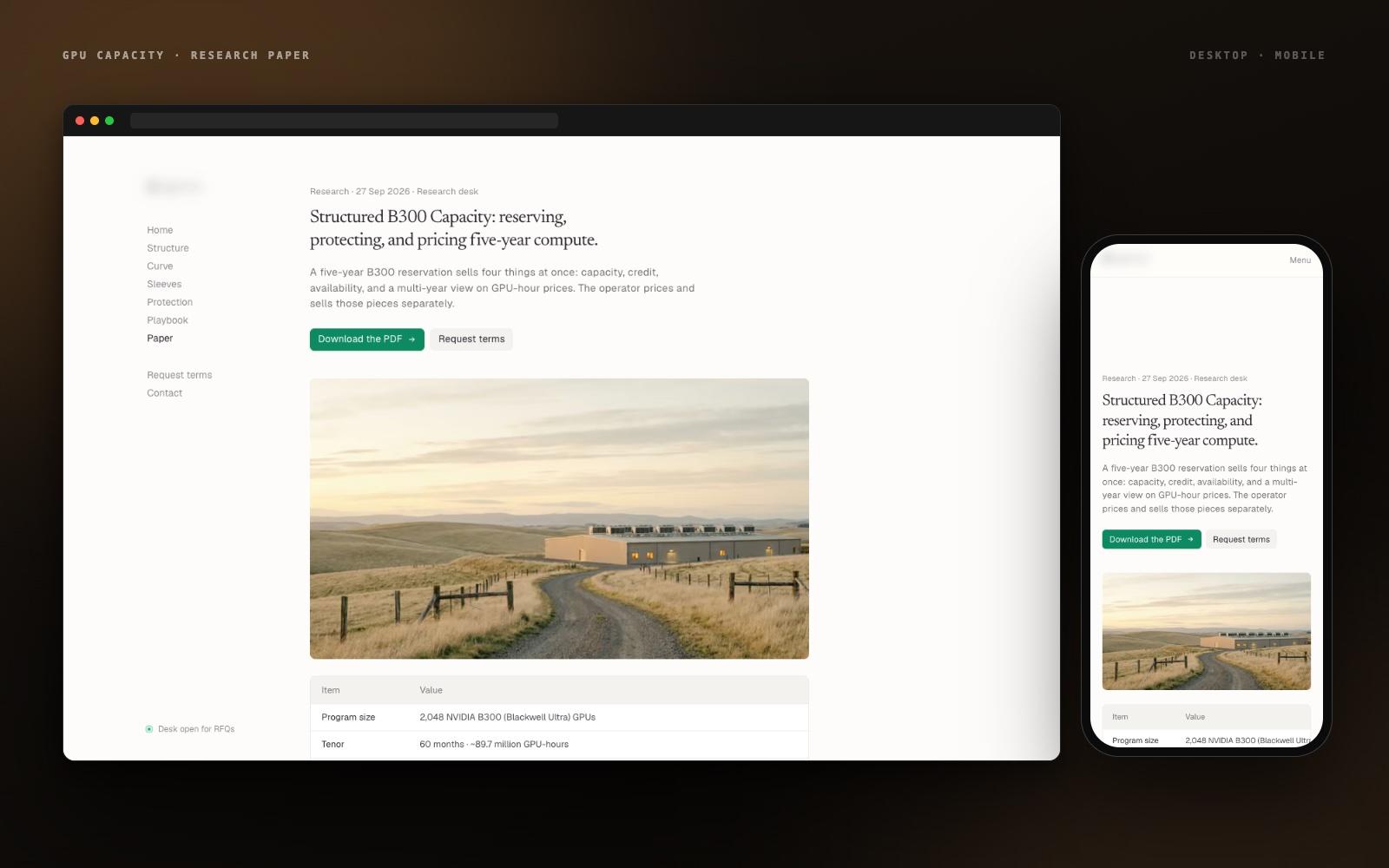
Serif headlines, a fixed side navigation, a muted palette, and landscape photography of real infrastructure. It reads like a research note, which is exactly how this audience wants to be sold to.
Paper and Request-Terms Flows
The research paper gets its own page with a download action, and 'Request terms' is reachable from every section — so the site converts the reader it has just convinced.
The Interface
Seven sections, one scroll.
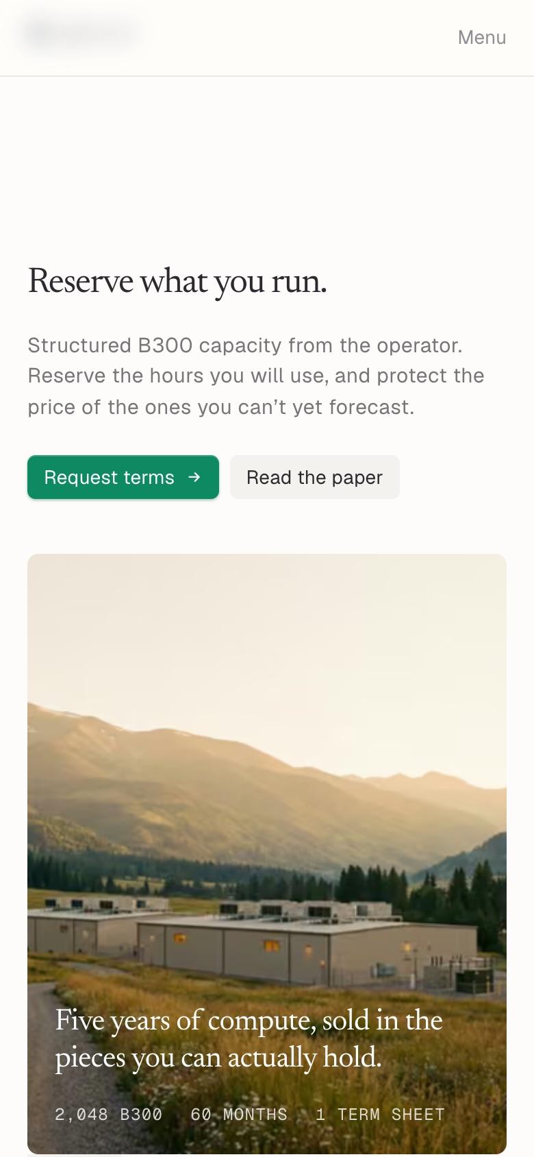
A fixed side navigation keeps the reader oriented while each section makes one argument — with a chart where a chart says it best.
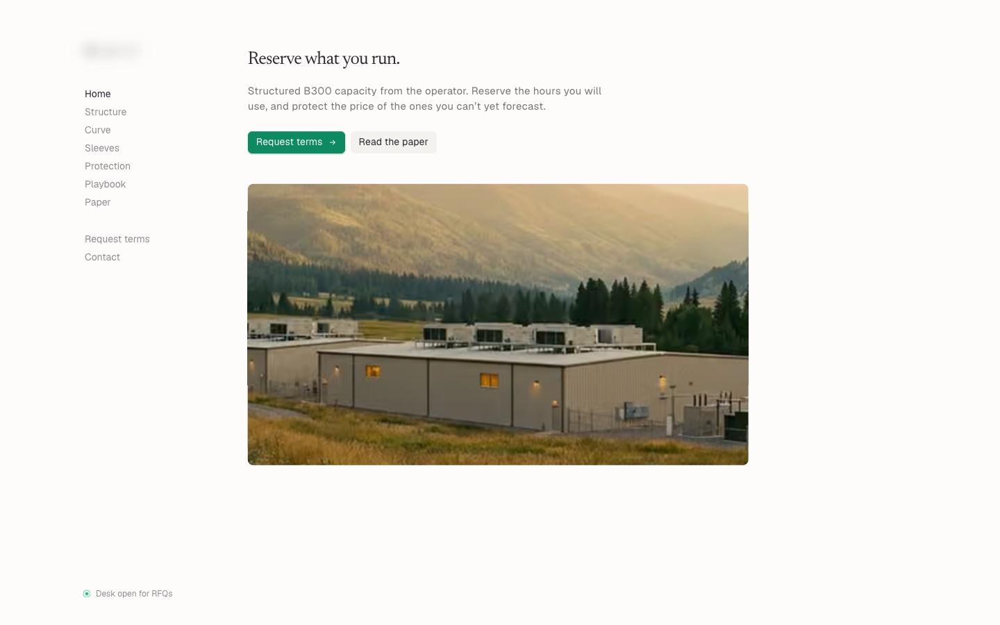
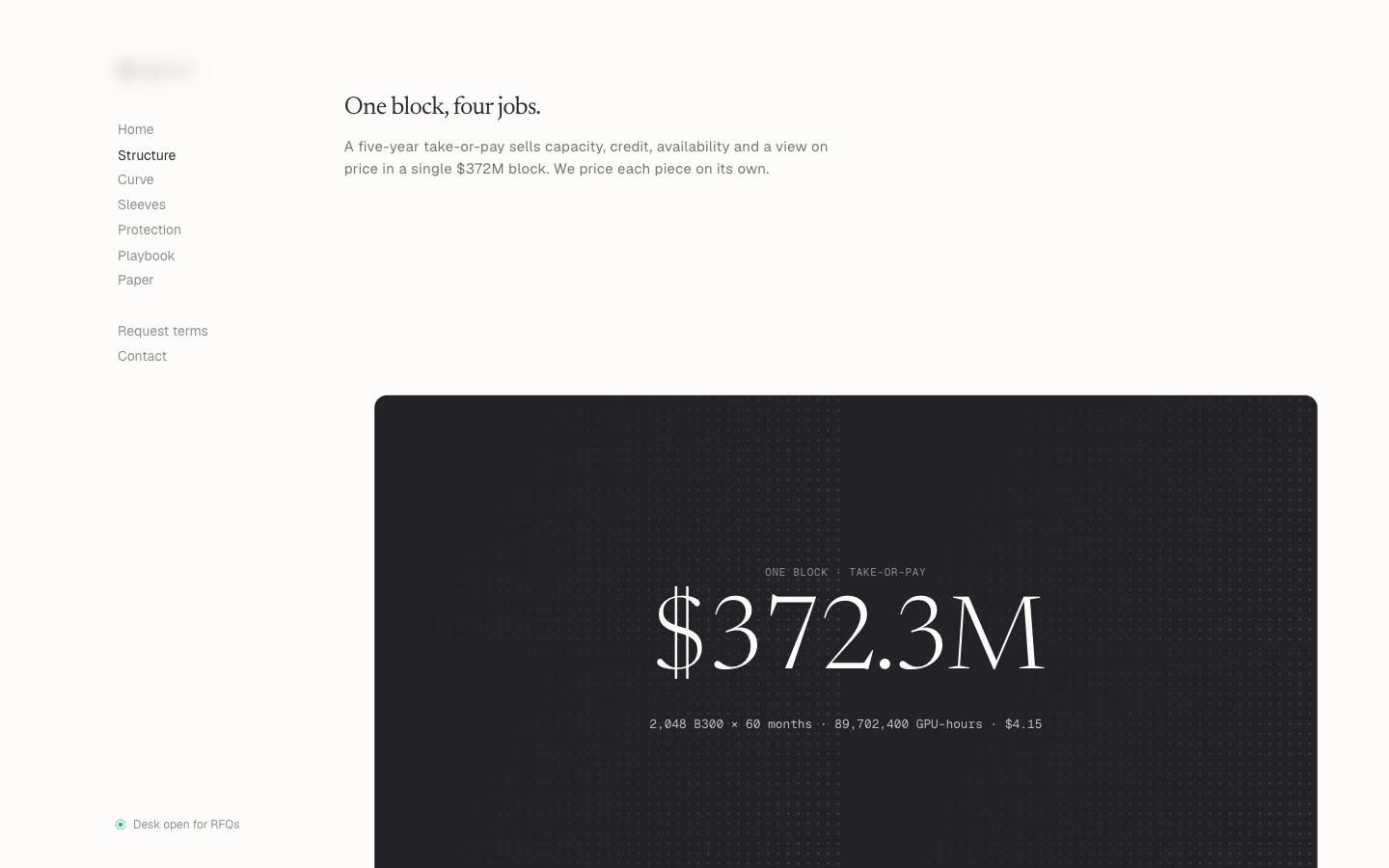
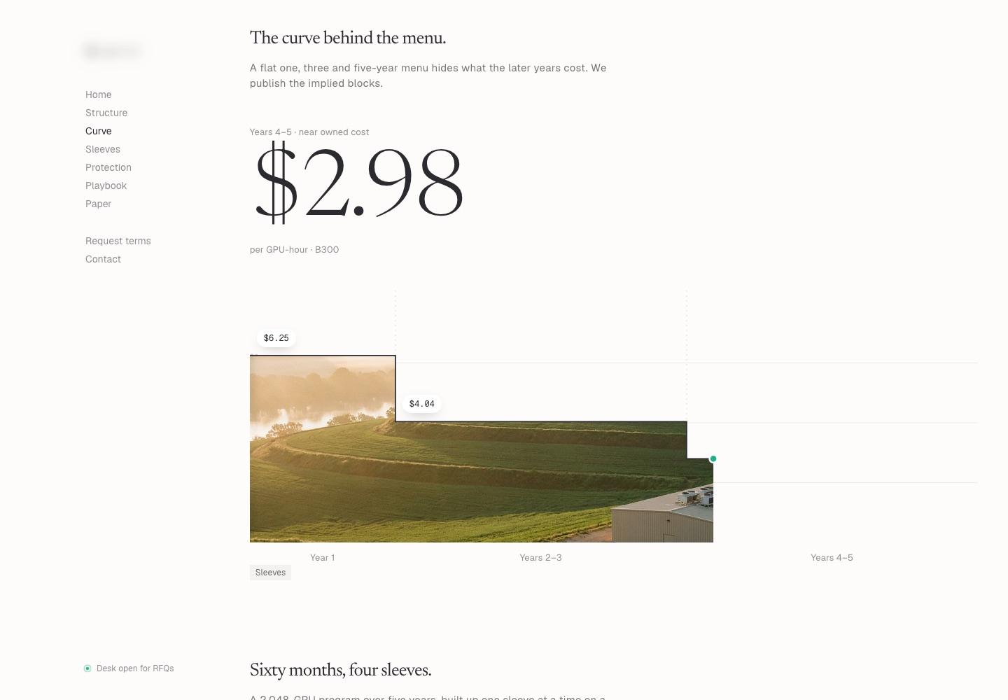
Responsive — on the phone
Selected Outputs
Built frame by frame.
The Impact
Live in a week. Owned by the client.
The client went from a first conversation to a deployed, handed-over site in seven days — with real charts, a paper page, and a request-terms flow, not a holding page. Two review rounds landed inside the week because feedback came against a live link. The team now edits copy and figures themselves, and the site carries the full argument for a structured product without a sales call.
7 days
Discovery Call to Handover
Day 3
First Version Shared
2
Review & Revision Rounds
3
Live Charts Built
The Research Behind It
Why a fast, credible site matters.
Independently published findings on how quickly visitors judge a site — shown to explain why we invested the week in clarity and speed, not as results we claim for this client.
53%
of mobile site visits are abandoned if a page takes longer than three seconds to load.
Source: Google / SOASTA research, 2017
50 ms
is roughly how long it takes people to form a first impression of a web page's visual appeal.
Source: Lindgaard et al., Behaviour & Information Technology (2006)
46%
of the comments people made when judging a website's credibility were about its visual design — more than any other factor.
Source: Stanford Web Credibility Research (Fogg et al., 2003)
More Work